Flat design has been a trend over the last two years, which has been fully embraced by Microsoft and Google, but which was truly consecrated as a contemporary approach by the recent conversion of Apple (that last bastion of skeuomorphic design) in its iOS7 mobile operating system. Let’s unpack some of these terms. The term ‘skeuomorphic’ is generally applied to all those surface finishes that do not represent the actual material out of which the object is made. In the case of graphic interfaces, skeuomorphs are all those elements that emulate the actual function or the appearance of another physical object. For example, the image of a wooden bookshelf may be used to divide the sections of a virtual bookshop: a rounded form with 3D relief effect may outline a button: we may have a representation of a dial that can be turned, or the texture of paper for note-taking.

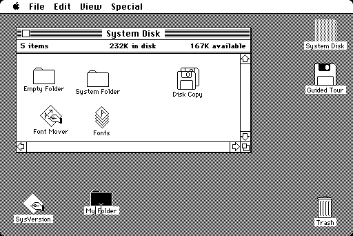
Apple Lisa Desktop: The dawn of skeumorphism in the visual formalization and iconography of the concept of desktop and files
This approach to interface design has grown in parallel with the graphics performance of personal computers.

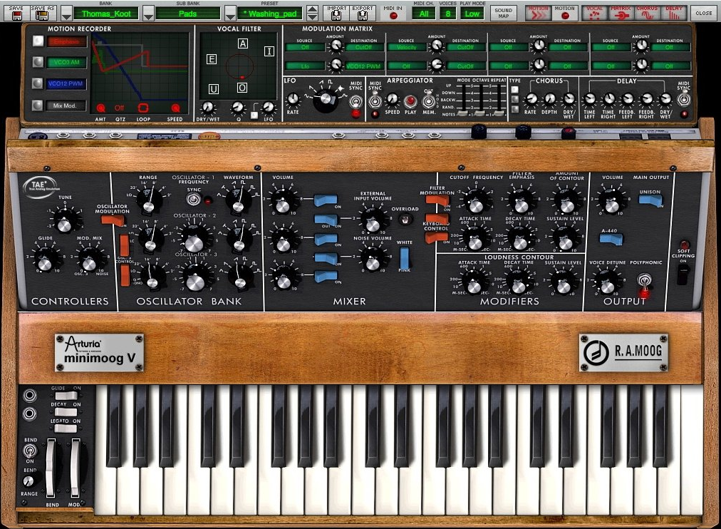
Skeumorphism: UI for the Arturia Minimoog V, a VST plug-in for audio software that perfectly replicates the famed synthesizer created by Robert Arthur Moog
Flat Design, on the other hand, uses flat, plain colors, palettes limited to a few clear tones, libraries of minimalist icons and typographic fonts that become integral parts of the design itself. Graphic ‘affectations’ such as shading and tonal nuance are stripped down to a minimum, relief and textures, indeed anything evoking three-dimensionality or a material quality in a graphic object disappears.

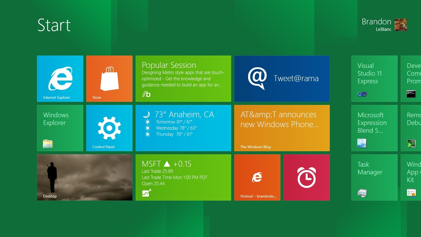
Flat Design: UI of the controversial Metro, the interface presented on the launch of Windows 8
Over recent years, with the rise of mobile technologies, graphic interface design has had to contend with less powerful devices, with limited autonomy. Performance and the need to make the best of the resources available has in some ways enforced a ‘step backwards’. This scenario has been accompanied by growing expectations on the part of consumers for interactivity and fluidity in use. And so Flat Design has been ‘technologically driven’ to some extent it is not a pure trend in graphics, but contains a kernel of necessity. It is much easier for a graphic processor to produce a plain color in real time than it is for it to generate a gradation of tones, complex shading or fine textures, especially if it all has to be interactive, with dynamic animations and transitions.

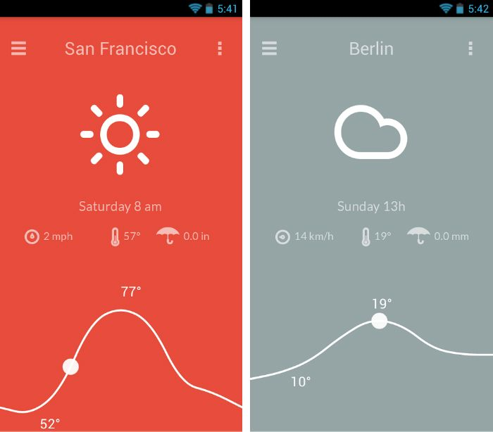
Flat Design: UI of a Meteo smartphone app
But how are users reacting to these events? From the consumer point of view, both approaches have their pros and cons, and the appeal here is often more to common sense than to trend surveys. Metro has generated much confusion among Windows users, (partly because of the drastic paradigm shift involved), and similarly iOS 7 has wrong-footed that portion of Mac users who recognize a button from its three-dimensional characteristics. In planning applications, we constantly have to bear the user in mind. Especially in environments dedicated to productivity, it is important to make common operations speedy, intuitive and lean. Skeuomorphism (folders and files and desktops are all skeuomorphic concepts) have ‘conditioned’ us in our software use and for some of us, our behaviors are evoked by the form of the component. Therefore the choice between a more realistic orientation and a more reductionist Flat look has to take these issues into account. Paolo Limoncelli