Visual representations allow contents of any kind to be communicated in a very rapid and functional way: we will now analyze the operational phases needed to represent a market offer using the techniques of visual thinking. The creation of the storyboard is the first stage and it consists in the drafting of the content to be transmitted: this phase, which is purely one of editing, may also be tackled in a series of steps. The main objective consists in creating a lean text that is not over-structured but oriented to the key words or phrases that are to be transmitted, those which make our product/service unique and describe its added value. Through successive phases of editing, then, one arrives at an initial textual schematic breakdown: the titles, the paragraphing, the parentheses, have to be locatable in a pattern, which in our case is a sequential one (e.g. question/answer over several stages). Now comes the visual design phase: the editor hands the work over to the designer, who decides on a basic style to use and extracts visual metaphors for the concepts described. 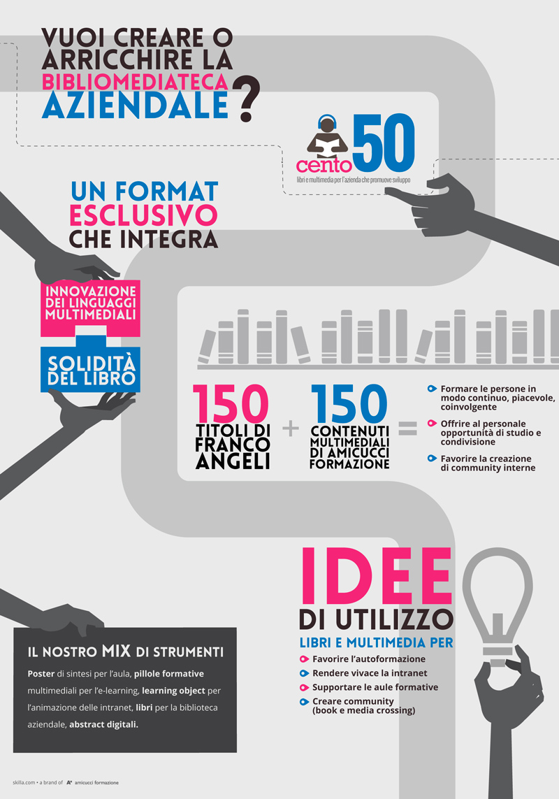
The infographic composition is very important: this is graphics and text that are harmonized as far as possible, maintaining legibility and keeping it pleasing visually. 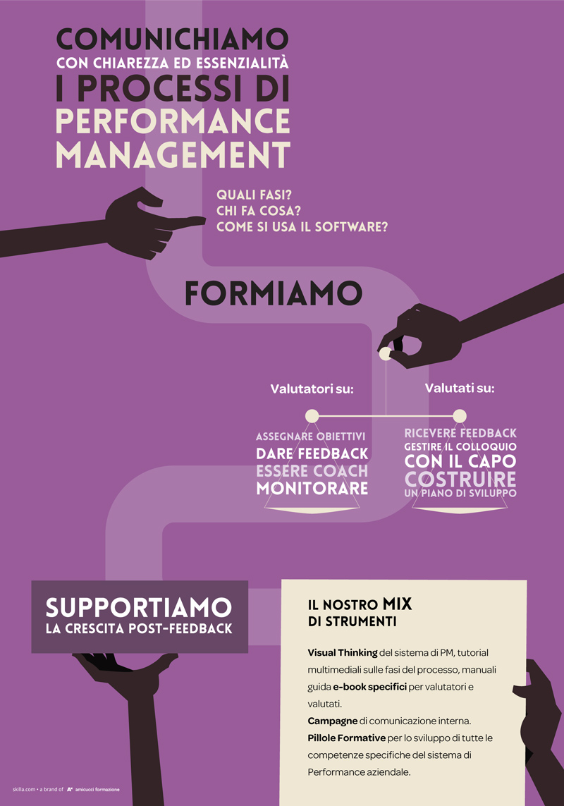 In order to define the composition, it may be useful to refer to the rules of composition belonging to painting (the golden section, for example) or to photography (the rule of thirds): sometimes overly symmetrical representations can induce a kind of perceptual laziness, and so need to be used with a lot of care. If the quantity of information provided is important, and it is not possible to cut or summarize the textual part, it may be expedient to indicate a ‘reading direction’ to the reader.
 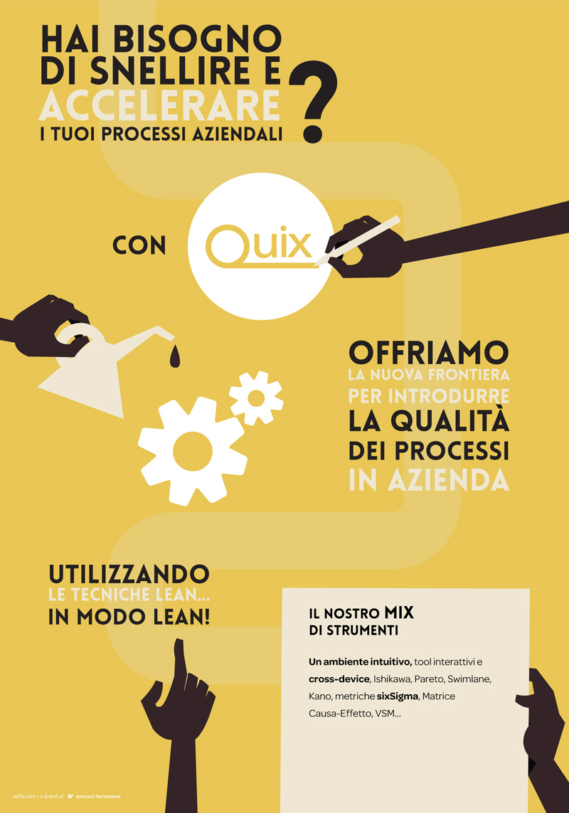 Here, to round off, are some useful tips for creating infographics:
- use only few types of font and assign to them specific ‘containers’ (title, paragraph, quote, etc.)
- choose a limited and harmonious color palette
- use illustrations intelligently: it is a good idea to try to keep a balance between images and text and not to show details too starkly, to avoid having the observer spending too much time on them and relegating the message to second place
- avoid transmitting the selfsame information both in text and image, as it will create redundancy.
Paolo Limoncelli