insights

Responsive Design in Mobile Learning

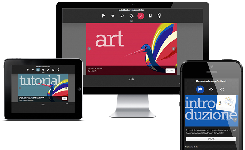
Responsive Design: almost four years have passed since this term first appeared. Since then, the global community of designers and developers has embraced this approach, codified by Ethan Marcott, and terms such as fluid grids and breakpoints have by now gained currency in user-interface design, as much for web designers as for those dealing with web apps. The Web is full of articles on Responsive Design and associated technologies, and this contribution does not wish to tackle what should by now be seen as a shared culture. In the context of designing e-learning platforms, the Context-Centered Design (CCD) paradigm has been (and continues to be in some cases) the preferred route.

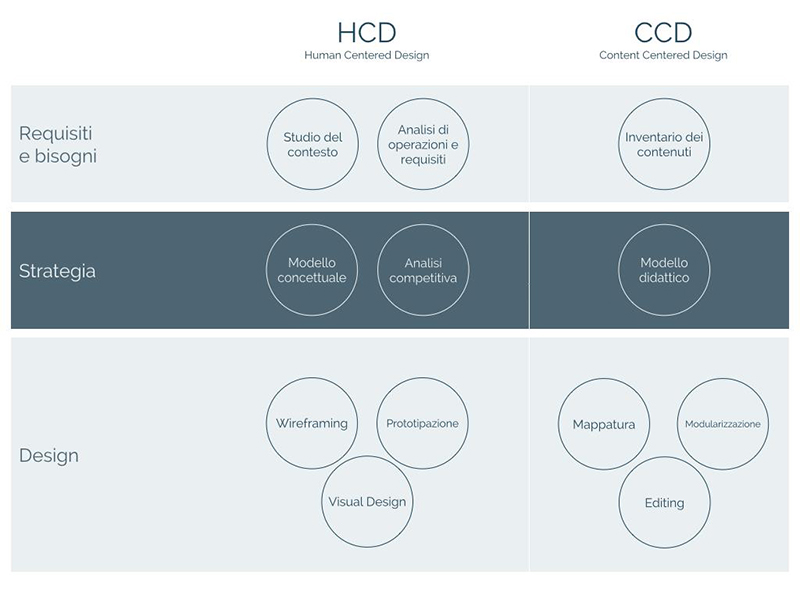
Schema che mette in parallelo HCD e CCD

Everything pivots on the contents, which have to be transmitted in an efficient way, although the learner’s role is now interchangeable with that of the user, who is no longer the passive figure imagined at the start of this century: the supine recipient of those interminable slide shows. It has become clear that if brilliant results are to be achieved, CCD and Human-Centered Design (HCD) must inevitably be made to converge. Clearly, this makes the design process more complex and multi-faceted, but these difficulties can be overcome. Responsive design represents a strategy of soft transition of the user’s experience as applied to the ‘technological’ context with which they are familiar: be it smartphone, desktop or tablet. The contents of a resource with educational scope may embrace this philosophy, both from the purely technological point of view as from those of methodology and teaching theory. These two realms do not actually have hard borders, and the product will turn out to be truly effective if they are tackled concomitantly.

The pill educational Ax, for example, show different resources based on what is the scenario of use. But it is not enough to filter the resources and activities considered effective for the level of interaction allowed by the (hardware) device: responsiveness becomes complete when it is applied to the content itself – for example by intervening in the duration or fragmentation of the resource in the mobile context, as well as on the dominant medium. This can be done, for example, by giving more weight to audio for smartphones, compared to conceptual/graphical visualization, which is more effective on more generous screens. If we unite with this an increase in interaction possibilities as screen-sizes grow (with transfer to devices with larger screens) or targeted and equivalent planning of the user’s experience of the activity (e.g. via a test) for a smartphone, then we can talk about Responsive eLearning Design. Responsive Design nonetheless remains an approach to cross-devices that operates on the principle of finding lowest common denominators: often tackling a project by taking it to be the only alternative, which may prove to be an over-simplification, or prove uneconomical. The key to the success and efficiency of our digital product lies, therefore, in keeping the end user in mind: they have to remain the central element in each phase, from conception of the project through to final testing. Links and references Ethan Marcotte’s blog Strategies for the application of the principles of Responsive Design Adaptive Design as an alternative to Responsive Design UI Design Patterns for the cross-device Paolo Limoncelli

written by: Paolo Limoncelli , 3 December 2013

May also be of interest

© Copyright 2024 Amicucci Formazione | P.IVA 01405830439 | Cap. Soc.: Euro 100.000,00 (i.v.) | C.C.I.A.A. (Macerata) | R.E.A. (149815) | Privacy policy | Cookie policy | Etica e compliance