When we want to create presentations either to share with colleagues, to send to friends or to help us during a presentation, we often turn to Microsoft Power Point to help us communicate our message clearly. Just as often, however, we sometimes see awkward presentations that do not encourage learning and participation and neither do they hold people’s attention. Usually we strive to decorate and enrich our slides so much that they become overstated: instead, in order to be truly useful, they must be clear and simple. Here are 5 useful practical tips for creating an effective Power Point presentation.
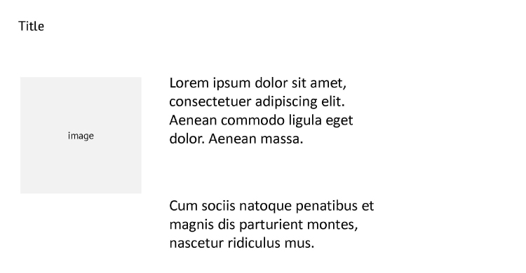
- Prepare a general outline and keep to a pattern. We can give a function to every part of the slide: for example, we always put the title and subtitle in the top left hand corner and we use this pattern in every slide. It is as if we were being economic with space: people’s eyes process and metabolize the structure we have assigned therefore, in the slides that follow, they concentrate on a specific portion (in this case the central part, where the content varies) rather than having to reprocess the whole slide every time.

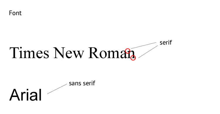
- Calibrate the fonts and the size of the text. It is estimated that people read 25% slower on a monitor than on paper: therefore, it is better to avoid fonts with flourishes and choose linear ones, which are easier to read. Characters are in fact divided in two macro-families: those that have flourishes (serif) and those that do not (sans serif). The flourishes are the projecting strokes at the terminal parts of the letters: therefore, Times New Roman is a serif character and Arial is a sans serif character. The same principle is applied to the declination of the character: regular, bold, italic and bold italic. It is better to use the first two and to avoid italics, or to only use them in small portions of text, perhaps for a quote or a short sentence. It is also better to avoid using more than two characters belonging to different families at the same time: the result would be a chaotic slide! The size is also very important, especially if we have to project our slides: the optimal size for easier reading, below which we should never go, is 24 points. As opposed to a book, a screen projects an unstable image and emits light, therefore suitably-sized characters are less tiring for the eyes, as is an optimal contrast between the background colour and the text. Subdividing the text into portions can also be helpful, using bullets and short paragraphs.
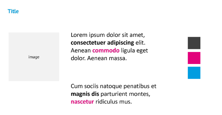
- Choosing colours. We only need three harmonious colours we can use three different ones or different shades of the same colour. Click here to see some harmonious colour combinations. We can then give them a semantic value that is, assign them a specific function: for example, in a paragraph we can insert some words in bold and at the same time use colour to highlight key words for people to remember. Creating a cover slide with a solid colour background can help create breaks in the presentation, which can be useful for creating a reference, for underlining key concepts or a change of topic, as well as regaining people’s attention. The higher the contrast between the text and background, the easier it will be to understand, but we must pay attention to our colour combinations!
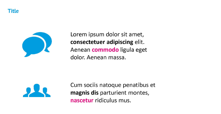
- We can use icons, although they mustn’t be too detailed. The icons should help us simplify the concept, they mustn’t add further content. They are ideal for defining more abstract concepts and, unlike images, they are less likely to confuse or convey multiple messages they mustn’t be contextualised and they should keep the presentation uniform and “clean”. On the contrary, images with a lot of detail can distract people’s attention and using decorative ones is the biggest error we can make. If we really want to use them, we should focus on simple images that express a single concept and, in particular, support the message we want to transmit.
- Outline the content. It is always better to use a few extra slides and wider-spaced text, rather than the contrary. Adding is easy, the difficulty lies in capturing the essence, eliminating everything that is superfluous to understanding. Remember that a large-sized, short text is easier to read and therefore helps us grasp the concept. For complex content, an index could be useful or, better yet, a conceptual map that helps people follow the talk without losing sight of the big picture!
 The same principle is applied to the declination of the character: regular, bold, italic and bold italic. It is better to use the first two and to avoid italics, or to only use them in small portions of text, perhaps for a quote or a short sentence. It is also better to avoid using more than two characters belonging to different families at the same time: the result would be a chaotic slide! The size is also very important, especially if we have to project our slides: the optimal size for easier reading, below which we should never go, is 24 points. As opposed to a book, a screen projects an unstable image and emits light, therefore suitably-sized characters are less tiring for the eyes, as is an optimal contrast between the background colour and the text. Subdividing the text into portions can also be helpful, using bullets and short paragraphs.
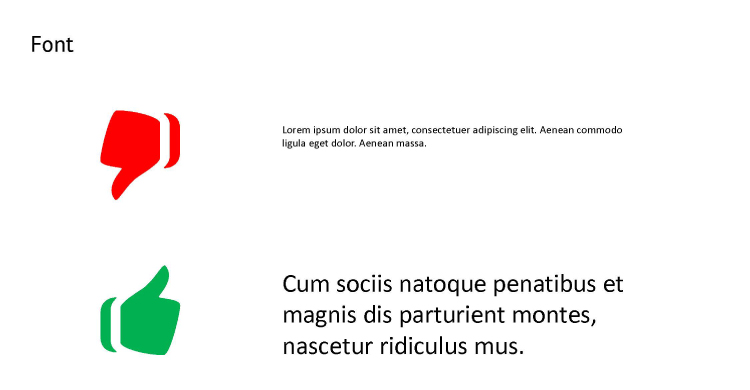
 Creating a cover slide with a solid colour background can help create breaks in the presentation, which can be useful for creating a reference, for underlining key concepts or a change of topic, as well as regaining people’s attention. The higher the contrast between the text and background, the easier it will be to understand, but we must pay attention to our colour combinations!
 On the contrary, images with a lot of detail can distract people’s attention and using decorative ones is the biggest error we can make. If we really want to use them, we should focus on simple images that express a single concept and, in particular, support the message we want to transmit.
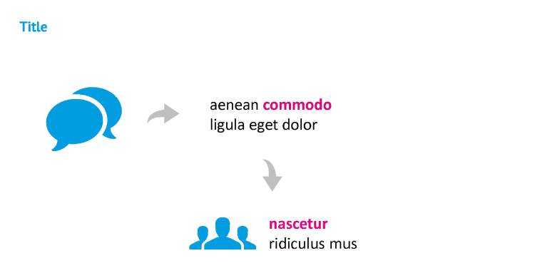 For complex content, an index could be useful or, better yet, a conceptual map that helps people follow the talk without losing sight of the big picture!
Michela Scocco